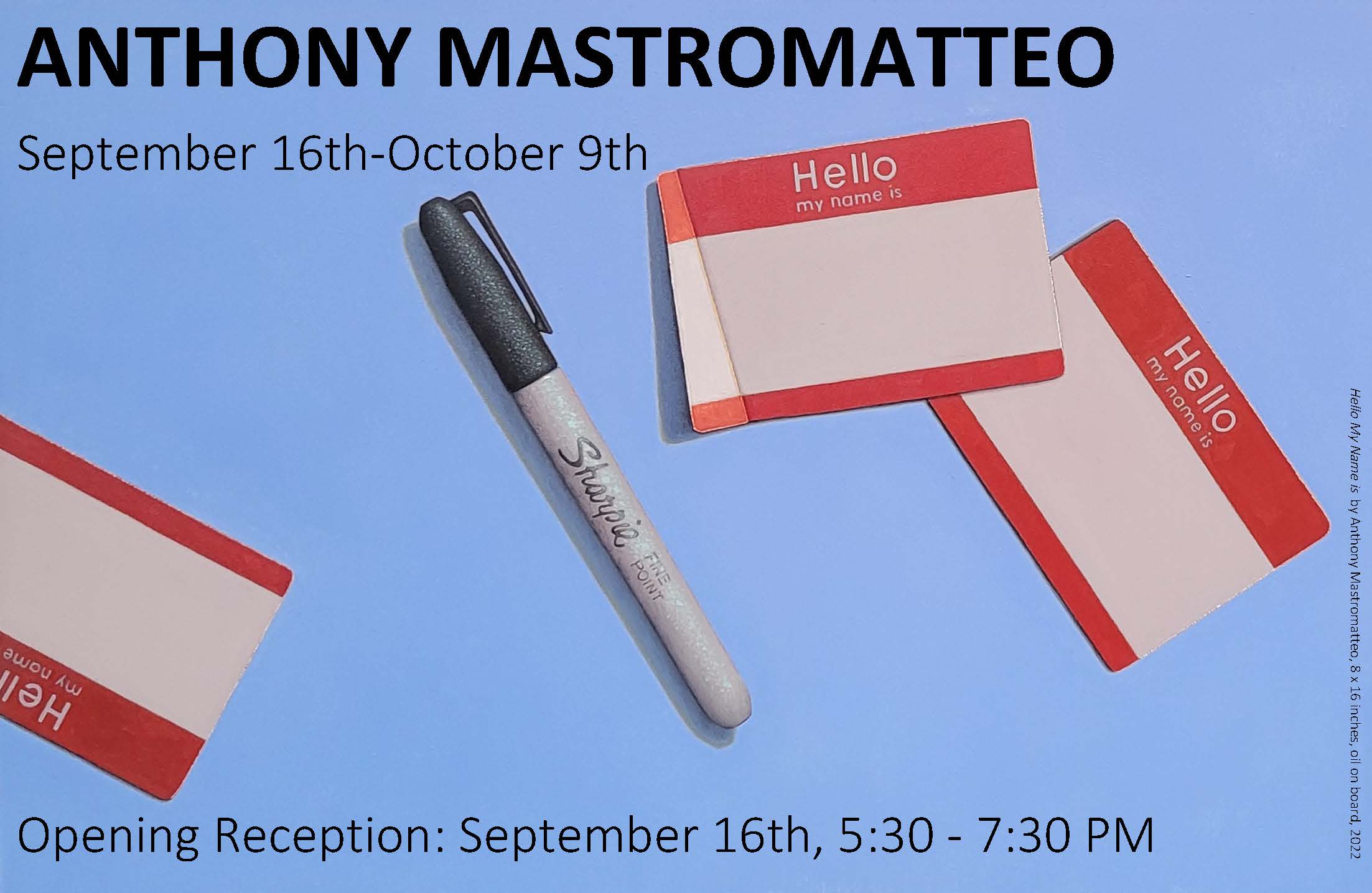
The Grenning Gallery is pleased to announce our latest exhibition: Hello My Name Is: Anthony Mastromatteo, a solo exhibition reintroducing the contemporary realist painter to our clients after 18 years. Bemusing and brilliant, he is a classically trained painter creating philosophic compositions. Irony is never lost on this artist, who cleverly declares that “Trompe L’Oeil was the first Modernist movement” and proves his claim via his own hyper-realist oil paintings which force the viewer to dive deep into their psyche; discerning reality from artifice in various subjects both foreboding and sometimes hilarious. This exhibition will be on view through Monday, October 9th, 2023. Please join us for an Opening Reception on Saturday, September 16th from 5:30-7:30 pm.
Anthony Mastromatteo (b.1970 | Talmadge, Ohio) grew up in the American Midwest, where big-box stores took root in towns surrounded by miles of cornfields. A simple, sometimes lackluster lifestyle propelled him to leave the quietness, enroll in Princeton as an undergrad. After graduating with his Bachelor’s Degree in Art History, he moved to New York City, where he landed a job with Christies Auction House. His experience in the Art World grew in synchronicity with his interest in Art Making. After enrolling part-time at the Art Students League, he discovered one of the first classical ateliers in NYC The Water Street Atelier, headed by Jacob Collins, (which is now known as, Grand Central Academy). We met Mastromatteo here in the early 2000s, as he was one of the early students sopping up this hard-to-come-by training. While devoted to realist painting techniques, his works stands out among what is now a sea of fine painters. Mastromatteo’s knowledge of art history and philosophy informs his cleverly contextual compositions. At first glance, one might label him as a Pop-artist, yet his work has highly intellectual undertones that elevate his style to new peaks.
In preparing for his first major exhibition at the Grenning Gallery, Mastromatteo was inspired to introduce, or, re-introduce himself after years of only painting for his most dedicated patrons. Hello My Name Is features a scattering of the typical nametags we all know, with big red borders and simple, matter-of-fact text in white, and a blank white space for one to write their name. A black sharpie is situated amongst these tags, anxiously waiting to be picked up, capped-off, and penned down. This composition is not only a grouping of familiar objects that are expertly painted; It is also an ode to the struggle of an artist, as he gets ready to make a new painting. How will he fill that white space, or canvas, and what will it mean for his identity? This anticipatory anxiety is elaborated with droplets of condensation atop the marker – it’s sweating – literally. Furthermore, the placement of the black sharpie is deliberate, referencing traditions of a famous Supremetist in art history, who importantly shaped the attitudes of Mastromatteo’s work.
In 1994, Mastromatteo saw the retrospective for early 20th Century painter Kasimir Malevich at the Guggenheim Museum. Suprematism valued non-representational art to the extent that paintings were void of all imagery.
Mastromatteo was struck with the collection of Malevich paintings, claiming “They really made sense to me. There’s a cleanliness to them.” The black square was the most impressive, and he learned that in 1915, Malevich had first exhibited it installed above the door, on the left…which reflects the Russian tradition of placing a religious icon over the door. Mastromatteo mused: “There is something spiritual about the black square…it represents profundity via a high amount of simplicity. It projects the feeling of reverence. When you look at it, you can hear a stillness, and that is when it’s right.” This profound feeling Mastromatteo felt while observing Malevich’s black square stuck with him and informs the majority of his work. A realist painter inspired by a movement of non-representational painting, is an oxymoron – and a highly contemporary concept.
“Is it intellectual bullshit? Or does it spark a feeling in you?” asks Matromatteo. His answer is found in the last 20 years of painting… “YES, it moves me deeply."
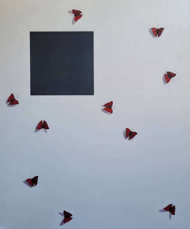
In Being and Nothingness Mastromatteo pays homage to Malevich’s black square, and even positions it at the top left quarter of the canvas. The modernist symbol is austere, and formidable, yet it lays flat on the two-dimensional plane. Outside the square, amidst a wall of white, are little butterflies. Their angled wings cast shadows on the wall, elevating the fluttering creatures to the third dimension. A playful blending of the severe, and the beautiful – results in a tongue-in-cheek composition paralleling the flat modernist icon with a hyper-realist representation of a fleeting aesthetic entity from nature.
Continuing his affinity for Malevich’s geometric paragon is Felix Culpa or ‘Must be a Woe,” this time, in red. Three red squares hover above Christ suffering on the cross—one of the most recognizable images in art history—yet here, no wooden cross is in sight. Christ simply floats against a white wall. The three “Red Squares” map the edges of the invisible crucifix, and an old violin, a vessel for creative expression, reaches upside-down, forming the end of the (invisible) holy wooden structure. Mastromattteo provides the schematic for the symbol he knows we will form in our mind. The canvas is bisected in two, where a jigsaw-puzzle seems to have taken shape—Mastromatteo’s way of showing us that the violin exists on another spatial plane from the top of the canvas. However, there doesn’t seem to be room for the violin underneath this puzzle—poking a little fun at the flatness of Modernism. The color red finds its way from the Suprematist squares to the edge of the puzzle intercepted by the violin. The red puzzle piece turns into dripping blood. We look back to the red squares and see the three bloody stigmata instead of an ode to Modernism.
This composition has less to do with religion than it does with the aesthetic struggle of a creative. The “religious verbiage”—as Mastromatteo puts it—is one way of explaining this struggle. The title must not be forgotten when meditating on this painting: Felix Culpa, or ‘Must be a Woe.’ The first part is the latin for “happy fault.” The second, the title of an Emily Dickinson poem:
Must be a Woe—
A loss or so—
To bend the eye
Best Beauty's way—
But—once aslant
It notes Delight
As difficult
As Stalactite
A Common Bliss
Were had for less—
The price—is
Even as the Grace—
Our lord—thought no
Extravagance
To pay—a Cross-
Both the “happy fault,” and the “Woe,” force us to look at something so familiar with different eyes. This is the artist’s job, and job well done—to help us see anew something we all think we know.
Although deeply imprinted by Malevich, Mastromatteo also finds inspiration from other mavericks in art history, as well as pop-culture. In Ideal he compares Piet Mondrian’s infamous grid painting of 1942, “Composition with Red, Yellow, and Blue” with comic book scrap image of Superman, who is also circa 1942. Each muse is not ornately placed on a pedestal or chiseled to perfection. On the contrary, the Mondrian appears to be printed on a postcard, and Superman was torn from an old comic book; its paper yellowed with age. The two papers are taped up to a grey non-descript wall, divided by a thick piece of white tape, giving each a proper, symmetrical space - like the slides in Art History classes—a comparative study. It’s clear why Mondrian would appeal to Mastromatteo, as his affinity for clean lines sing music to his precision-flocking ears. Superman, on the other hand? Well, first, he is from Cleveland, an Ohio city not far from the artist’s hometown. Furthermore, he is a hero who doubles as an ordinary man, Clark Kent. The immeasurable excitement one can find from the possibility of living near, or working beside a superhero in what seems like “no-where’s-ville” USA, will endure from childhood long into late adulthood.
There are eerie similarities though that brought Mastromatteo to place these icons side-by-side. The primary colors and simplified vision of the “Ideal” that has been mass-produced (one on a post-card, the other through comic books) unite the “serious” art with the entertainment figure.
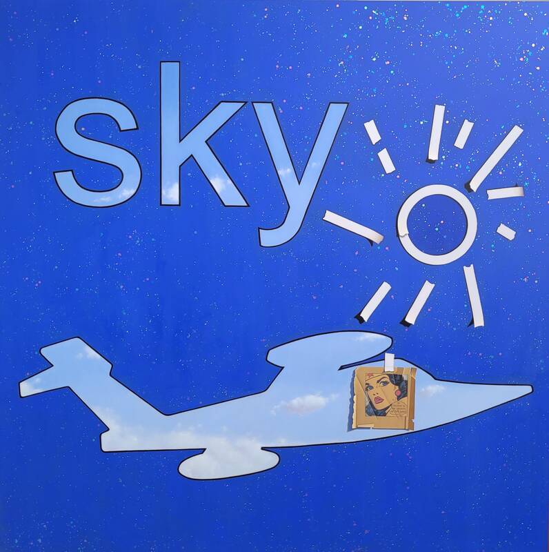
Another familiar Superhero is found in Wonder, or the Plane of the Invisible. Wonder Woman is another mid-20th Century American Icon, with a perplexing means of transportation. Her “Invisible Plane” was always of course, invisible, and the silly way she sit’s in an imaginary seat flying through the air would force the artist to wonder, “how do you represent an invisible plane”. Here, we see a bright blue canvas, sprinkled with glittery paillettes; an outline of an airplane beneath an outline of the word “SKY”, an infantile depiction of the sun made of masking tape, and finally, the hero, Wonder Woman, her comic clipping taped onto the invisible plane. A very believable, naturalist blue sky with puffy white clouds is visible through the letters and the invisible airplane. It feels like we can reach into the invisible plane to find the natural world…yet atop the plane is an old cartoon of the first female superhero. She overlaps the realistic atmosphere, and even casts a shadow onto it. The planet’s orbit is dedicated to the sun, and all living things need the light to survive…yet this most important element is made up of a crude array of tape strips, asymmetrical, and even torn in-half. This sun refers back to Pablo Picasso’s sun in his painting “Don Quixote”. And finally, the rich blue backdrop that makes up 90% of the painting, is coated in glitter – a medium which children adore, and artists are ashamed to use. It creates a sense of kitsch – because what realist painter would dare to utilize glitter? Yet, this painting is a meditation on the concept of Wonder. Although the image is perplexing and forces one to search for meaning, ultimately the viewer will feel the phenomenon. Aristotle said that “Wonder is the start of all Philosophy”. Upon reflection we find the word SKY leaves a sense of wonder on our tongue. And even when you turn the lights off, and the image goes away, this canvas will still glisten.
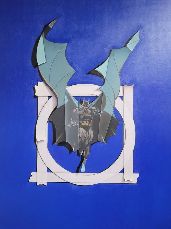
In Non-Virtruvian Man we see a faded cardstock cutout of Batman set within a circle, inside a box, made up of white tape, of course. The hero is frozen in motion, his cape’s wings fly upward, extending his form outside of his taped boundary. The title of this painting informs us of Mastromatteo’s inspiration: Leonardo Da Vinci’s Vitruvian Man (c.1490). The notable study of DaVinci’s makes claims on human proportions, however it is a lie that humans are made of divine proportions. We are not perfect, in our natural most primitive forms, as DaVinci depicted. Nor is Batman exactly who we claim him to be—a miraculous superhero skilled with supernatural capabilities. The truth is that he is a wealthy man, an ordinary human, who uses technology to allow him to be a super-human.
One of the most confounding paintings in this exhibition is “The Painting, As Seen by the Wall”. Mastromatteo depicts a bare canvas, framed in reverse, turned-around. He presents the back of the painting to the audience, meticulously portraying the wooden stretcher bars, and neatly affixed staples, which hold the canvas taut in place. The overall image pique’s the logical side of our brain, forcing us to investigate what might be on the other side, but the painting has no front. Conversely, it has two backs! The artistically rendered image doesn’t exist, or perhaps it resides somewhere in the center, inaccessible to the viewer. But in actuality, this painting is about nothing. Similar to Seinfeld, the overall generalization of the content forces us to consider the objective from a variety of perspectives. Mastromatteo’s composition is abstract in context, where a big ornate frame should be surrounding a majestic portrait expertly crafted. It’s a very old-fashioned style, affixed to a contemporary glorification.
Interestingly, Mastromatteo is also acknowledging the 20th century master Claudio Bravo, with this painting. Bravo made auction history in the late 20th century when a small painting of a wrapped canvas went to the MOMA for over $1m. Later in 2011 Bravo created a triptych of the backs of three canvases.
Lovely Mary Jane is a candy wrapper, taped to a blue wall. It’s trash, glorified. But this is not a political statement about commercialism or recycling. This painting was inspired by one of the top 10 banned books across the country, Toni Morrison’s “The Bluest Eye” which is about a young black girl who wishes she had blue eyes, an envy shaped from her love of her favorite candy, Mary Jane. It’s a heartbreaking notion caused by an ideal of beauty perpetuated by a marketing campaign for a sweet treat. Classical painting also hails a certain ideal of beauty… and one wouldn’t usually find something as insignificant as a candy wrapper as the focal point of their pièce de résistance. However, Mastromatteo is asking us to see that here is power in idealization, especially in something so seemingly throwaway. He’s prodding us to be more aware…to make people aware of the significance of the seemingly insignificant. The one power an artist possesses is that of forcing the viewer to look at something of his choosing…and in this case he’s asking us to look at something that may be garbage. Consider Maurizio Cattelan, whom in 2019 taped a banana to the wall with duct tape, and it later sold for $120,000…art forces the viewer to consider something that everyone is telling you to look at. Mastromatteo’s candy wrapper is taped up to the wall in a similar fashion as Cattelan’s banana…if we look long enough at the tape, we’ll notice it’s resemblance to the “not-equal” sign…bringing our thoughts back to Morrison’s distressed little girl. Another fun point to mention, Morrison also hails from Ohio’s Cleveland.
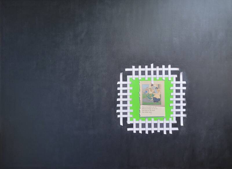
Toni Morrison continues to act as muse for Mastromatteo in “White Picket Fence (Aspirational Memoir)”. The focal point is a bright green square, encased with a picket- fence made of white tape. Inside the square is an old page torn from a “Dick and Jane” reader. These books were prominent in public schools from the 1940’s through the 1960’s, shaping the minds of America’s youth for decades. The page shows a family, together tending to their garden. The text reads: “This is the family you are, that is as happy as can be, that lives in the house that father made.” Here he unveils the seeds of what became 20th Century American Dream. Meanwhile, outside the fence, is an ominous black void, and represents the rest of Morrison’s story, which centers on a black family in Lorain, Ohio not far from his own hometown. Mastromatteo realized that his life WAS like this idealized family in the clipping – happily living within his own white picket fence, unfamiliar with the struggles and suffering that occurs outside the fence. Here, he is asking What are the consequences of this mass marketed image of the American Dream? Does one care for neighbors who don’t resemble them visually? How is it possible that something as innocent as a “learn to read” book could engender racism? Would one rather live in ignorance to these disparities, inside the fence with their perfectly mown green lawn? Or should one cross the fence and venture into the black unknown area where they may be confronted with the reality of deeply discriminated against neighbors. What’s worse?
The ideas behind Regarding Prometheus, or I Will Not Play with Matches are about rules, following rules, and transgression. The top-most item placed closest to the viewer’s plane, is the triangle ruler – which measures limits, and within it appears a yellow legal pad – the metaphorical ruler of law. Beneath the ruler is a number two pencil and a three-hole-punched piece of lined paper annotated with one repeated inscription: “I will not play with matches”. This resonates with any young juvenile who was caught breaking the rules in the in the 196os and 1970s. Further down the page, a Suprematist’s square re-appears, not in the famous red, or black, but instead - it’s been burned away – the outline creating a scorched window frame to the scene below. Within the burned hole, a single Joker card from a 52-deck pokes his head into frame. Adorned in red and black, as most classic playing cards are…but also perhaps a nod to the lost square. The Joker represents the figure in history who CAN transgress, and also his purpose is to be the one to tell the king the truth. He is ancillary in the deck of cards, as his truth is optional to authority. However, any average person learns by breaking the rules, either they learn how to get away with it, or they learn what not to do again. This painting invites the viewer to play with fire and receive the punishment from the gods.
Furthermore, in Greek Mythology Prometheus, who’s Ancient Greek name can be translated to mean “Forethought”, is sometimes referred to as the God of Fire. This stems from his story, of defying the Olympian gods by stealing fire from them and giving it to humanity. He is punished by Zeus for his transgression, with an excruciating daily cycle of torment. Nevertheless, Prometheus became a figure representing human progression, furthering society’s quest for scientific knowledge. His risks resulted in great benefits for mankind.
Mastromatteo’s collection of paintings express his never-ending fixation with reality. His paintings are so realistic that at first glance one is forced to question their eyes. Another, deeper look, sways one to consider other viewpoints; some current, others ancient. What are the norms that society has blindly accepted, and how long has humanity lived happily in ignorance? If a painting depicts a Northern White Rhino, one will assume that the Rhino in the image is attributed correctly, right? Is the anatomy of the creature, correct? Why would one question it? Does a comic book provide entertainment to the average American teenager? Or does it leave a multitude of American’s out entirely? Mastromatteo’s paintings are mysteries to be deciphered. He gives us clues as to what he was thinking while creating these paintings, but of course, there’s always room for external analyses.